Starbucks: People have never noticed this hidden detail in its logo
The Starbucks logo has a very interesting history and not only that, the mermaid in the logo has an added detail hiding right in front of us.
Starbucks has turned into one of the most iconic coffee brands in the world. Not only is the logo of Starbucks one of the most recognisable in the world, it is also quite distinct to look at for a very special reason.
The logo has the figure of a woman, wearing a crown with a star, with her beautiful hair cascading down around her face. As reported by Reader’s Digest, here’s the history behind this logo.
Meaning behind Starbucks’ logo
The name and logo of Starbucks were created in 1971 when it was first founded. The woman in the logo is actually a mythological sea creature, called a siren. The original logo was in white coloured design over a brown background and the mermaid with two tails.
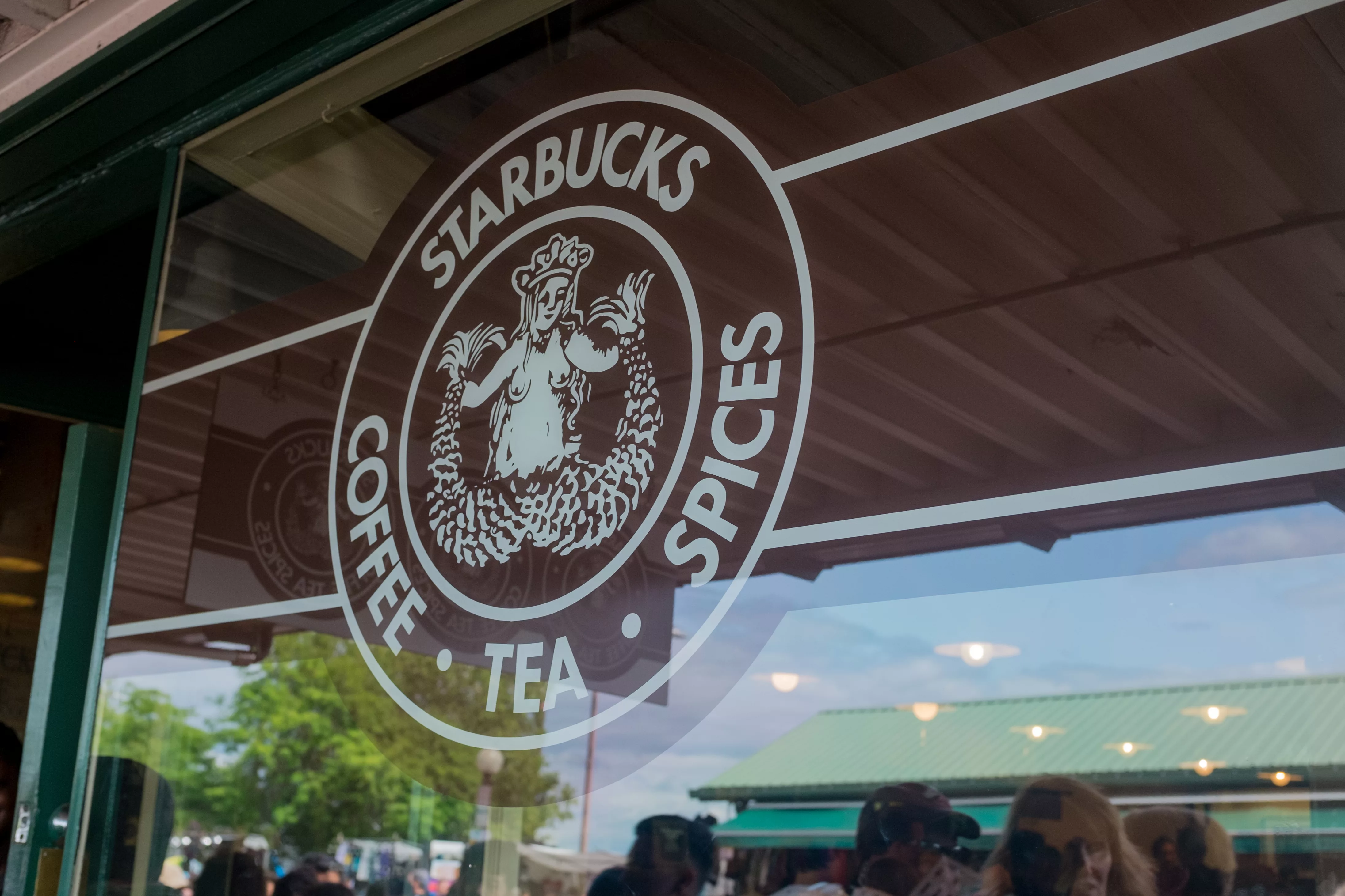
This logo was reworked by Terry Heckler in 1987, and this version became synonymous with the brand, in terms of design and colour scheme.
A representative from Starbucks is quoted as saying,
Starbucks’ name comes from the author Herman Melville’s Moby Dick novel, but the famous Siren logo was discovered while scouring old marine books.
Over the years, this logo has been revamped to keep up with the times. The logo that we are familiar with today is a rework of the earlier design and was created in 2011. The Siren’s hair received a makeover and so did her face, and you can still see her two tails peeking from around the edge of the logo. Also, the words ‘Starbucks Coffee’ does not appear in the logo anymore.
The hidden detail in the logo
Though the siren looked amazing after her modern makeover, the creators were not satisfied with how perfect she looked. They came to the conclusion that adding some imperfections to her could actually accentuate her appeal.
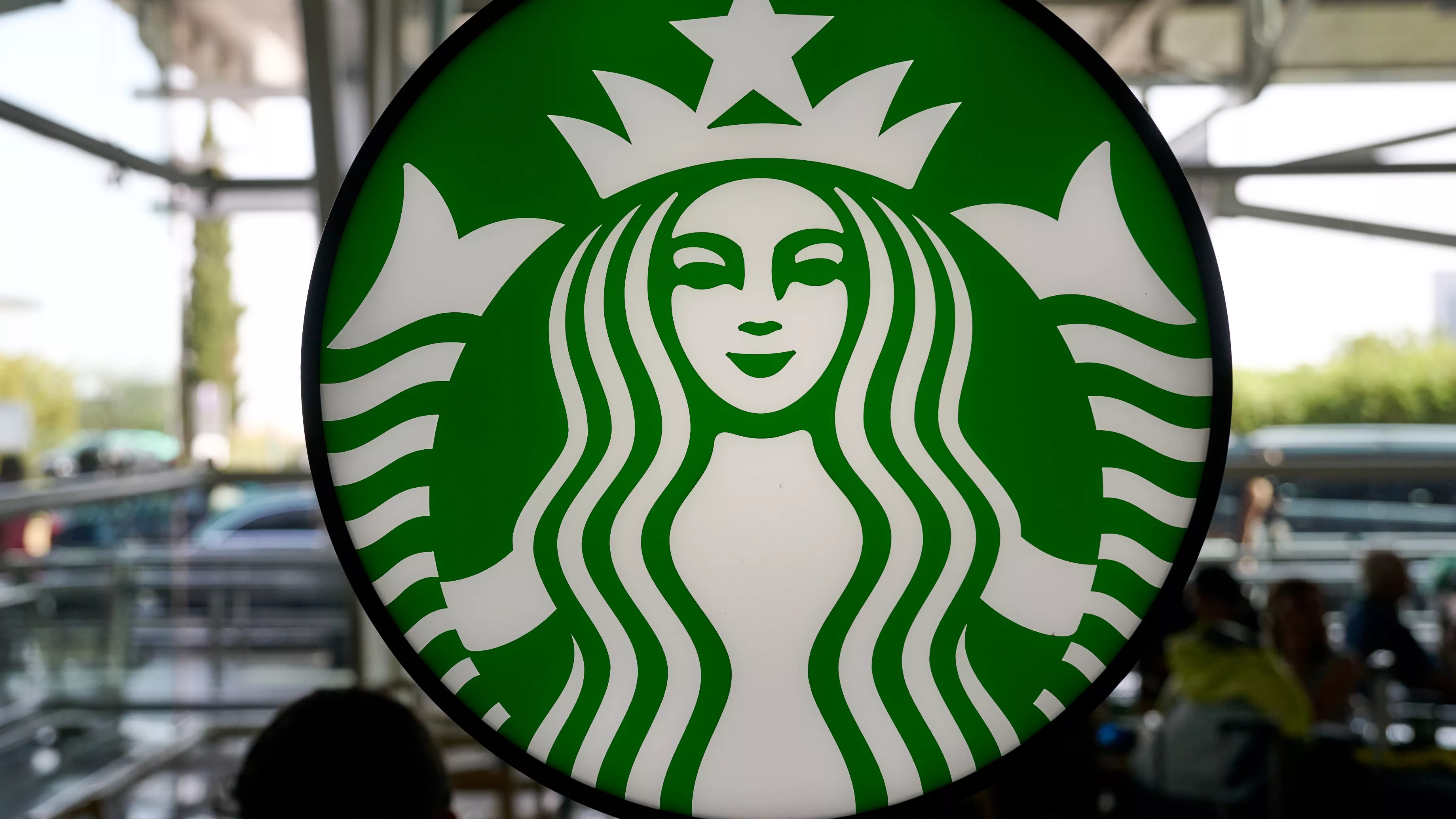
So if you notice the face of the siren, it is not perfectly symmetrical: there are subtle differences in how the lines are drawn for her nose on the left side of her face with respect to her right side.
Global creative director, Connie Birdsall, is quoted by the report as saying,
As a team, we were like, ‘There’s something not working here, what is it?'
It was like, ‘Oh, we need to step back and put some of that humanity back in. The imperfection was important to making her really successful as a mark.
Sources used:
Reader’s Digest: ‘The Hidden Detail on the Starbucks Logo You Never Noticed Before’
Logo Genie: ‘Starbucks logo | A brief logo history and what makes it so great!’